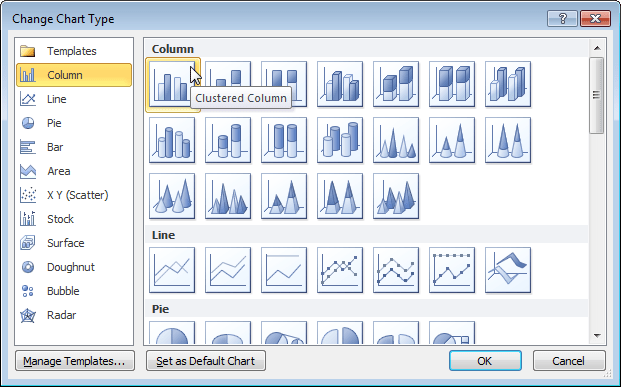
Variance on Clustered Column or Bar Chart
his post will explain how to create a clustered column or bar chart that displays thevariance between two series.
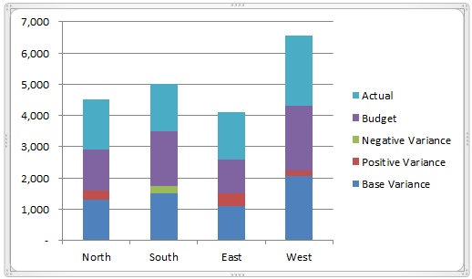
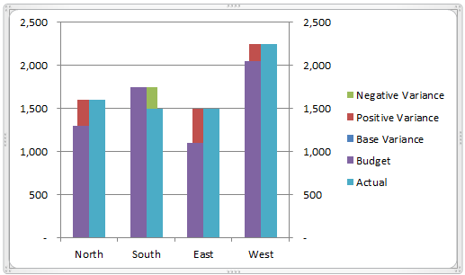
Clustered Column Chart with Variance

Clustered Bar Chart with Variance

Overview
The clustered bar or column chart is a great choice when comparing two series across multiple categories. In the example above, we are looking at the Budget versus Acutal (series) across multiple Regions (categories). The basic clustered chart displays the totals for each series by category, but it does NOT display the variance. This requires the reader to calculate the variance manually for each category.
However, the variance can be added to the chart with some advanced charting techniques. A sample workbook is available for download below so you can follow along.
Data Requirements
With any chart, it is critical that the data is in the right structure before the chart can be created. The following image shows an example of how the data should be organized on your sheet. It is a simple report style with a column for the category names (regions) and two columns for the series data (budget & actual data).
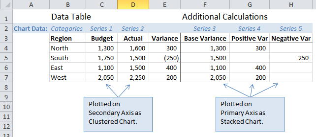
This technique only works when comparing two different series of data. This can include a comparison of any data type: budget vs. actual, last year vs. this year, sale price vs. full price, women vs. men, etc. The number of categories is only limited to the size of the chart, but typically you want to have five or less for simplicity.
Chart Requirements
The chart utilizes two different chart types: clustered column/bar chart and stacked column/bar chart. The two data series we are comparing (budget & actual) are plotted on the clustered chart, and the variance is plotted on the stacked chart.
The chart also utilizes two different axes: the comparison series is plotted on the secondary axis, and the variance is plotted on the primary axis. This puts the stacked chart (variance) behind the clustered chart (budget & actual).
How-to Guide
Data Calculations
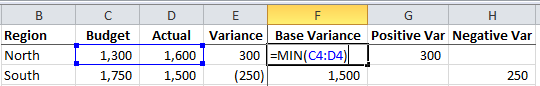
The first step is to add three calculation columns next to your data table.
- Variance Base – The base variance is calculated as the minimum of the two series in each row. This gives you the value for plotting the base column/bar of the stacked chart. The bar in the chart is actually hidden behind the clustered chart.
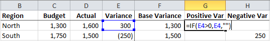
_ - Positive Variance – The variance is calculated as the variance between series 1 and series 2 (actual and budget). This is displayed as a positive result. An IF statement is used to return a blank value if the variance is negative. The blank value will not be plotted on the chart, and no data label will be created for it.
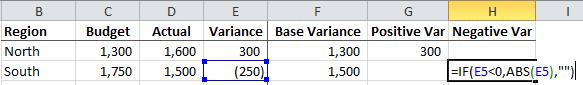
_ - Negative Variance – This is the same basic calculation as the positive variance, but we use the absolute function (ABS) to return a positive value for the negative variance. The negative variance needs to be plotted as a positive value to bridge the gap between the two series. Calculating this in a separate column allows us to assign the negative series a different color, so the reader can easily differentiate it from the positive variance.
How to Create the Chart
The example file (free download below) contains step-by-step instructions on how to create the column version of this chart. Creating the bar chart is the exact same process with stacked and clustered bars instead of columns.
The chart is not too difficult to create, and provides an opportunity to learn some advanced techniques.
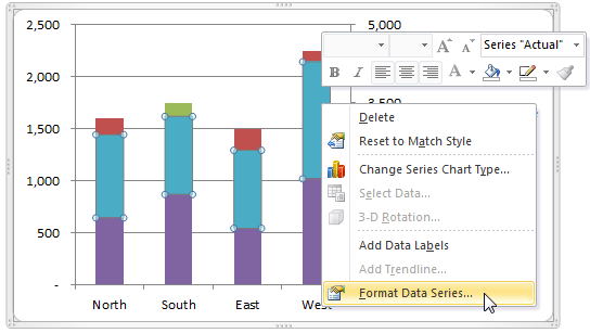
- The first step is to create a Stacked Column Chart and add the five series to it.
_
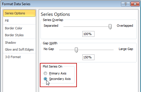
_ - Series 1 (Actual) and Series 2 (Budget) need to be plotted on the secondary axis. Right-click on the Actual series column in the chart, and click “Format Data Series…”
_
Select the “Secondary Axis” radio button from the Series Options tab.
_
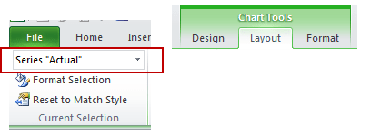
Repeat this for the Budget Series (series 2)._ - Change the chart type for series 1 & 2 to a Clustered Column Chart. Select the Actual series in the chart, or in the Chart Elements drop-down on the Layout tab of the Ribbon (chart must be selected to see the Chart Tools contextual tab).
_
Click the Change Chart Type button on the design tab and change the chart type to a Clustered Column chart.
.
_
We can now start to see the chart take shape. The Acutal and Budget data are displayed in side-by-side columns for comparison. The Variance series are displayed in the background as a stacked column.
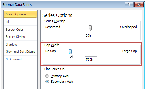
_ - Adjust the Gap Width property for both charts. The gap width can be changed in the Series Options tab of the Format Data Series window. This controls the width of the columns. A smaller number will create a larger column, or smaller gap between categories.
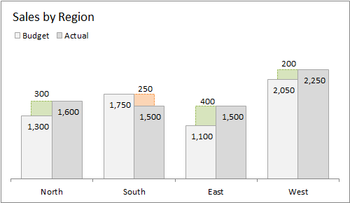
_ - Format the chart. The chart is just plain ugly with its default formatting options. We can make a few adjustments to make it more presentable.
– Move the legend to the top and delete the 3 variance series.
– Add a Chart Title.
– Delete the Axis Labels.
– Change the border and fill colors for the columns.
– Delete the horizontal guidelines.
_
_ - Add the data labels. The variance columns in the data table contain a custom formatting type to display a blank for any zeros:
_(* #,##0_);_(* (#,##0);_(* “”_);_(@_)
These blanks also display as blanks in the data labels to give the chart a clean look. Otherwise, the variance columns that are not displayed in the chart would still have data labels that display zeros.
_
The data labels for a stacked column chart do not have an option to display the label above the chart. So you will have to manually move the variance label above, and to the left or right of the column.

Summary
This chart is a great way to display the series data and the variance amount in one chart. The guide is meant to help you understand how to create and edit these charts to tell your story. The source data table is simple in structure, and the chart can be re-used with different data so you do not have to go through this process every time.
Please click here to subscribe to my free email newsletter to receive more great tips like this. You will also receive a free gift. It’s a win-win!

Download
Variance on Column or Bar Chart Guide.xlsx (185.7 KB)

The file below uses a slightly different technique by using a clustered column chart to display the variance, and then uses the Value from Cells option to display the data labels. This only works in Excel 2013. The advantage is that you can automatically display the variance label above the bar, and you don’t have to move it manually as the numbers change.
No comments:
Post a Comment